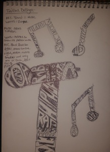
Personally I felt like my designs should be drawn on paper so I can easily create and draw my vision in my head.
This is my initial drawing and vision of what I wanted the poster to look like. However, when I finished I started to analyse it as I wasn’t entirely happy with it. I also added a key to why I drew what I drew. I drew a mic stand because everyone would associate the mic stand with music. Then I added music symbols to ensure the audience knew the topic about music. I thought that to show which genre of music is the most popular by making the text bigger. Meaning that the smaller the genre the less popular it is. I also added names of popular music artists to the musical notes to identify that the topic is popular music. However, I did’t exactly like the design here. I felt that I should make the mic stand bigger and move it more to the right so it fills the page up a bit more and shows the main focus of the poster. I also feel that I should make the musical notes smaller as they’re not the main focus of the poster. I might also display only 2 musical notes as I don’t want to pull focus away from the mic and stand which is the main focus.
